My College Prep


My College Prep helps to prepare middle and high school students for higher education without losing focus on their existing coursework. Having experience in education, many want additional resources for college preparation to supplement information from their guidance counselors and teachers.
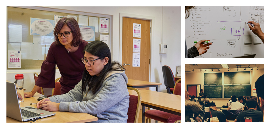
I was tasked to create this project to help students get a better grasp on the college application process and succeed in their current academic careers. Field research was conducted to develop the design process, and to help understand the target user’s goals.
Conducted:
— Research (Market Analysis, User Interviews)
— Information Architecture
— Wireframing
— Designing
— Prototyping
— User Testing (1 on 1 Usability Testing)
Me — Solo Designer
My College Prep was completed using an end-to-end process as a native and web application.
3 months to release the first version of the app.
With the influx of using technology instead of textbooks and paper products, many students are more likely to utilize digital resources to help them attain their academic goals.
The problem lies in their limited amount of tools to accomplish this objective. Many, if not the majority of middle and high school students of the information age, would respond quickly to notifications of internships geared towards their prospective focus.
The target audience for the project were middle to high school students, teachers, counselors, and professionals who are open to mentoring prospective students in their career field.
Since the rush of web and mobile applications, many schools have forgone the use of textbooks and other paper materials for more convenient technology alternatives.
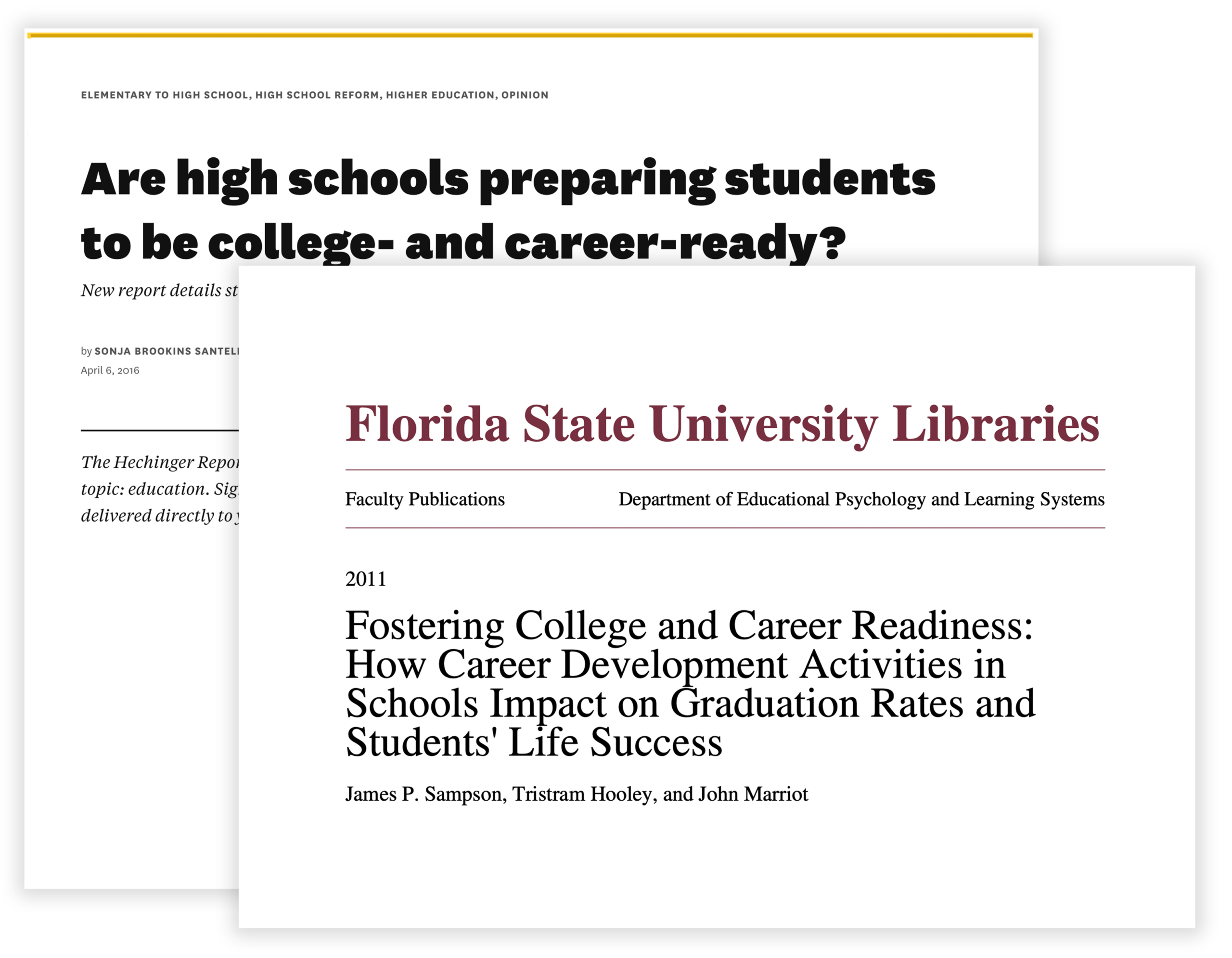
The above images show articles from The Hechinger Report, reporting on student college and career preparation in high school and FSU Academic Library system, discussing fostering college readiness.
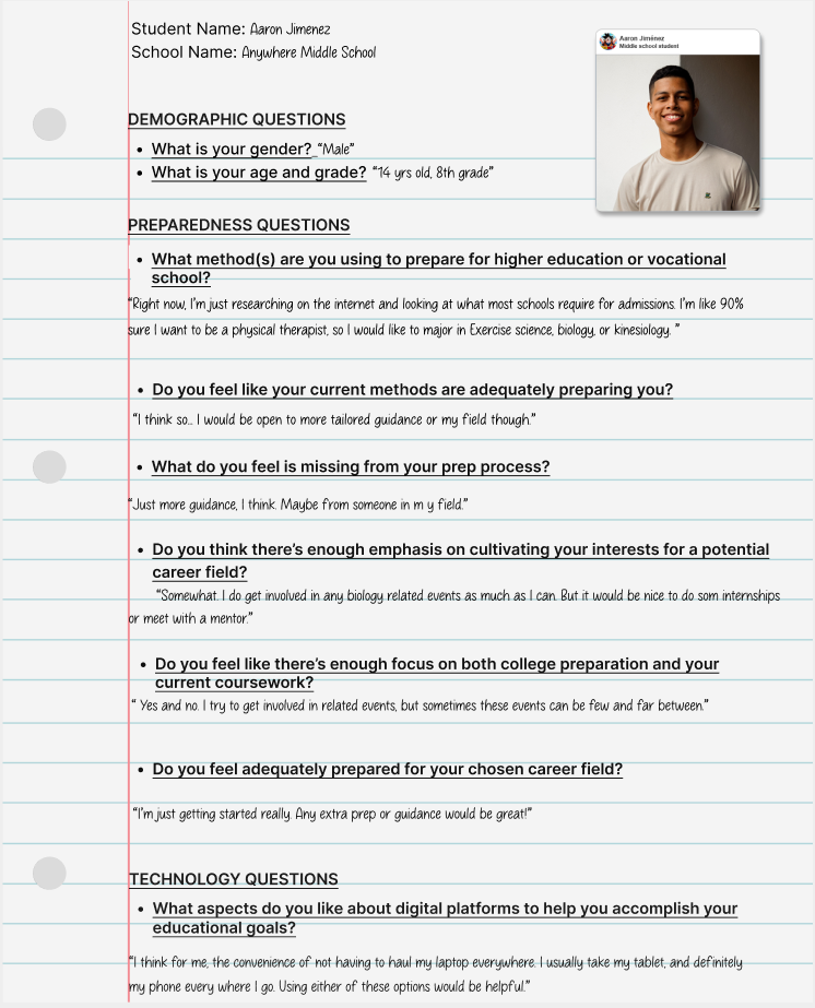
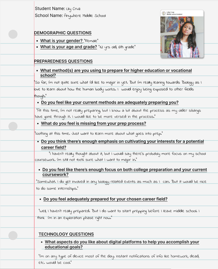
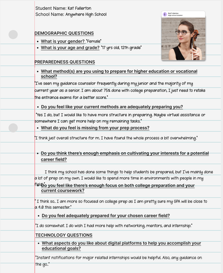
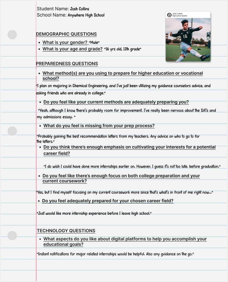
In order to further validate the idea, I conducted a series of 1:1 interviews with the primary base I was targeting. Participants were found on User Zoom to engage in a series of two 30 minute interviews. I utilized the responses to understand what participants would need to feel prepared for higher education, a career choice, and their existing coursework.
Questions were grouped into three categories:
Scroll on slides to view user research methodology:
User research was pertinent to discovering more about the target users and their preparation methods, frustrations, goals, and ultimately what they would like to accomplish with a potential application.
Before moving into the design phase, the main research findings were:
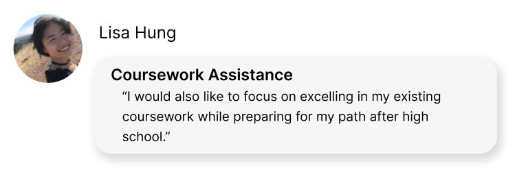
Many students felt there was not enough preparation for after high school and wanted a more comprehensive focus on how to put their best foot forward for the application process.
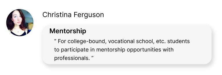
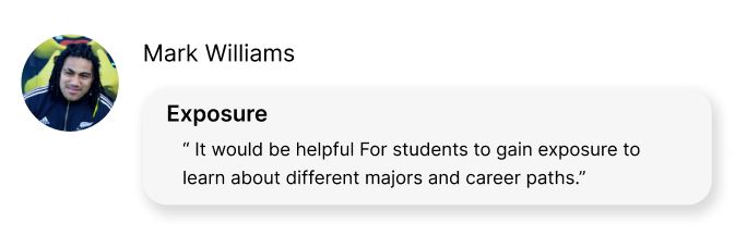
More career field exposure was also a topic that was mentioned. Students wanted to actually participate in mentorship opportunities or have more learning events available.
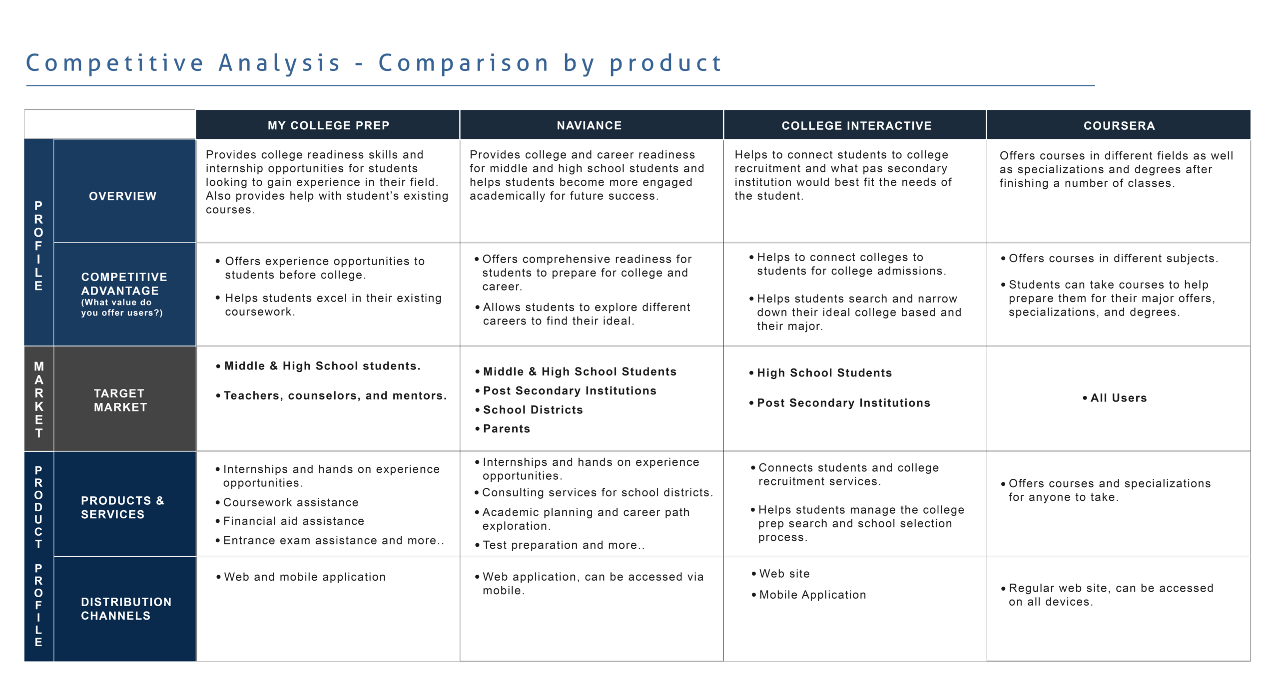
Early on during the research phase, a competitive analysis was performed to understand the landscape of solutions for the problem I was trying to solve. This was important in order to formulate a solid foundation for the application. My goal was to gain strategic insight on the flows, functions, and features that the competition possesses in order to continue the design process.
After some preliminary research and analysis of different college preparation applications, the majority of them focused on one topic instead of a comprehensive list.
For instance, College Interactive is a great tool to help match students with colleges depending on their career interests but mainly focuses on this point.
Naviance was the application I found to be the most well-rounded as it focuses on course direction and academic success while students are still in primary and secondary education, which courses to choose that would align with the students chosen college major, help with choosing a major, along with many other pertinent topics to the college admission process.
After this analysis, I found that an application that focused on both the student’s current courses and their post-secondary preparation would be most ideal for student to succeed.
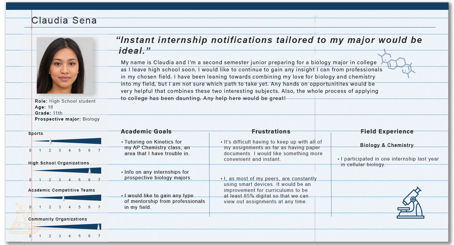
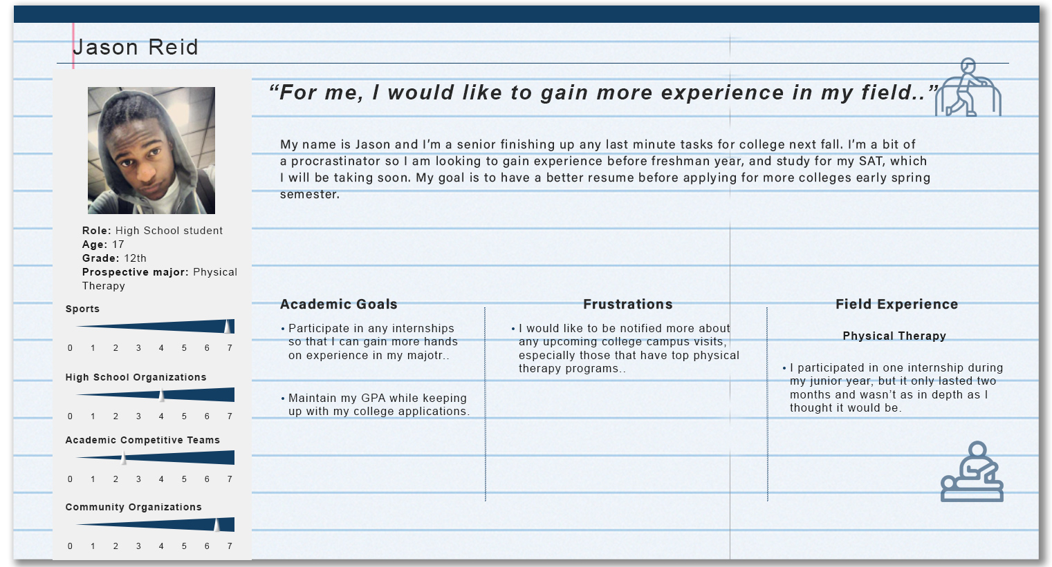
Before starting the ideation phase, user personas were created that summarized the research data collected. This helped to keep the user’s frustrations, motivations, and goals in mind when evaluating possible designs solutions. Research insights kept pointing to creating a native application for faster performance, better interaction, and a more responsive experience for the user.
Based on my conclusions from research and having a clearly defined problem to solve, I proceeded to the ideation phase by organizing my observations to help generate as many ideas as possible.
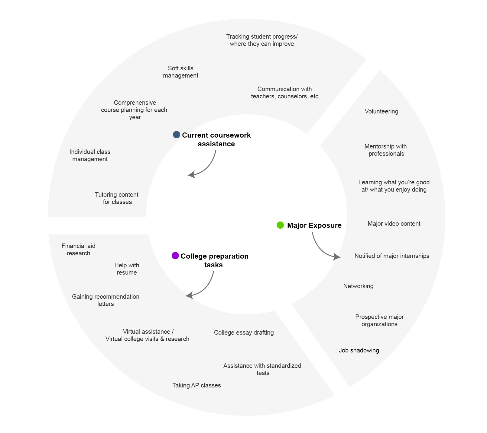
This phase was also a catalyst for forming options outside of the obvious ones and making room for innovation. The left image is a complete mind map of all the solutions and the right image is marked with an indicator that the solution may involve hybrid learning or virtual and in-person learning.
I found that the majority of the above solutions could be displayed online or via a mobile app, however many of the options would benefit from a hybrid solution where students can gain hands-on experience as some students learn better in an actual environment. For instance, tasks like job shadowing can take place in a virtual sense, but certain majors may be better experienced in an in-person setting such as biology or physical therapy.
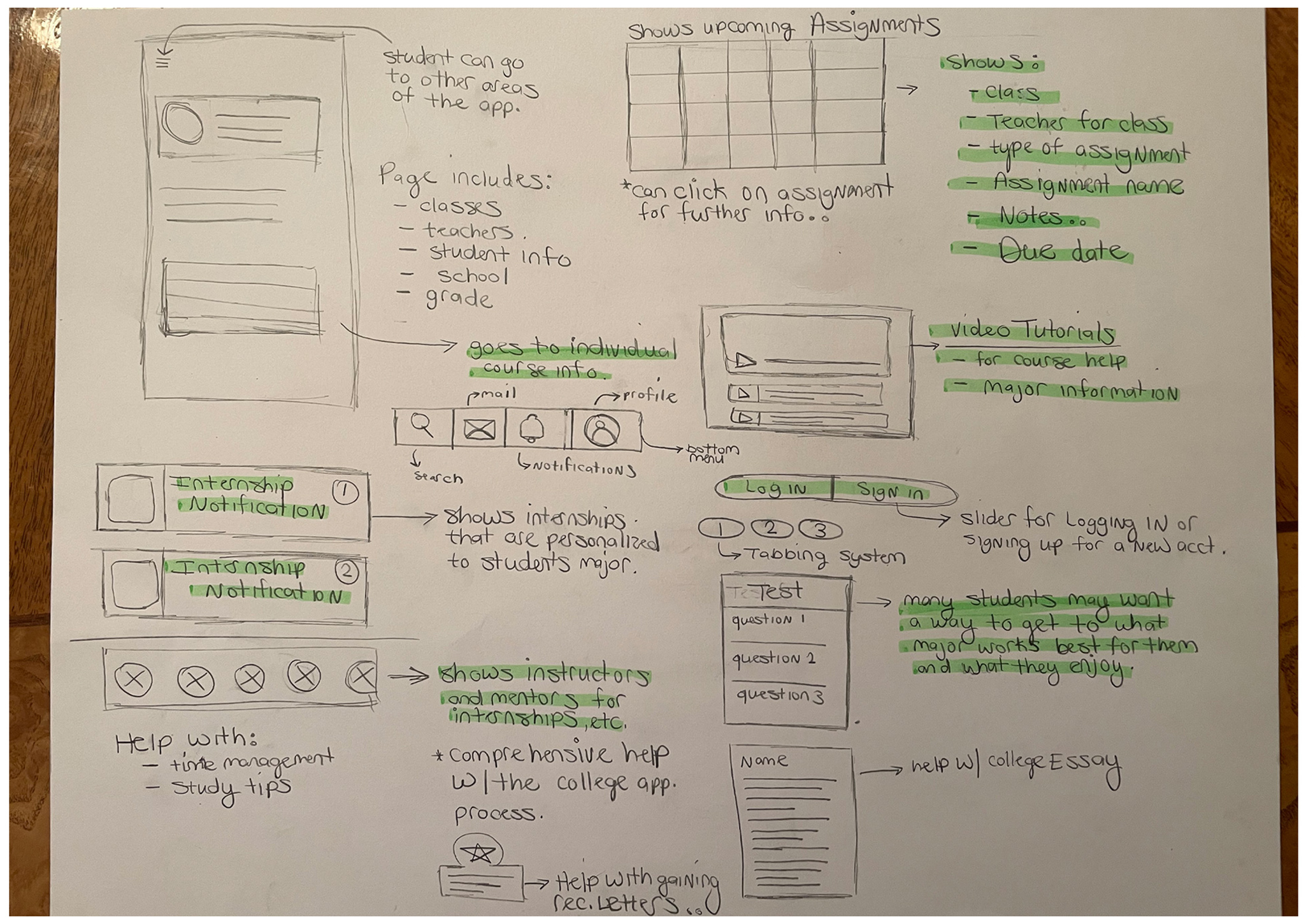
During sketching and storyboarding, a stepwise perspective was taken to design the structure of the application’s experience. In order to generate more ideas and further understand the several complex processes that will go into the application, I wanted to map out the main solutions before proceeding.
Before moving into wireframing, I wanted to get a basic understanding of what should be included in the UI and continue to generate more ideas for the application’s interaction. Sketching several concepts early on helped to ensure that a balanced and cohesive design was created.
For the design process, the most important feature was that the application was all-inclusive and simple to use for students, counselors, teachers, parents, and volunteers. Some features include AP class tutoring, course videos, and study tips for passing important exams.
Students can also receive feedback from professionals in their chosen field and have a convenient place to keep up with all their homework, project assignments, and class syllabi among other documents. Another objective of the application is to stress the importance of face-to-face communication and interaction between students, mentors, and teachers which includes:
— Building strong relationships and communication skills.
— Gaining actual hands-on experience
— Helping with time management skills
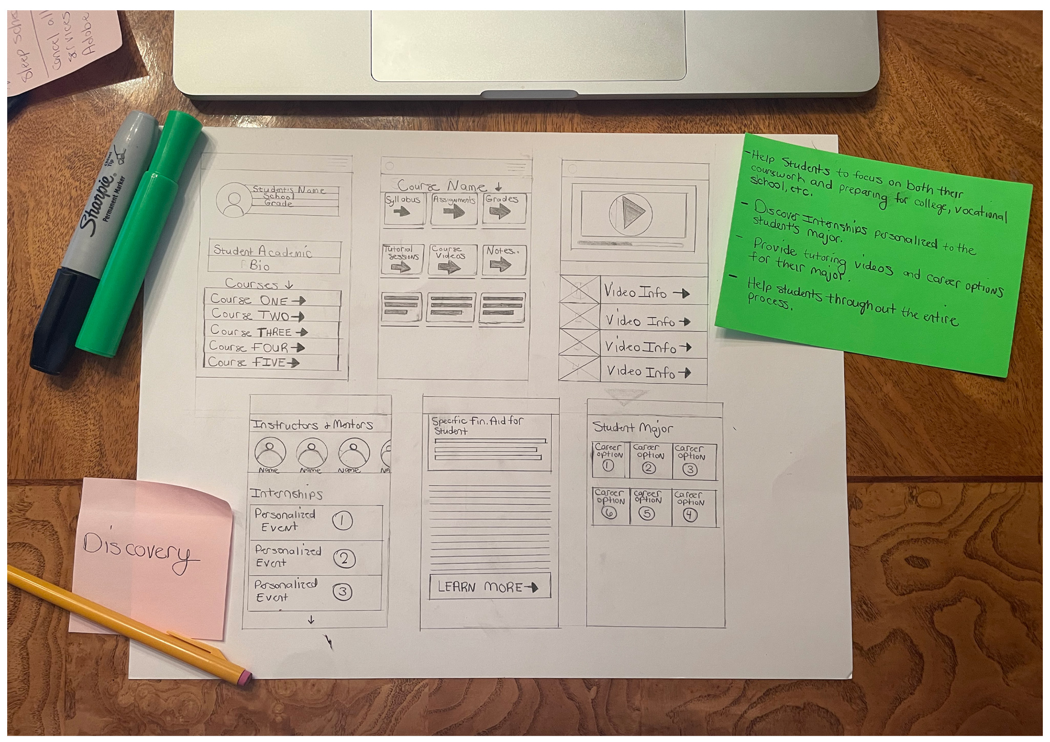
Before starting any prototypes or development, I wanted to first communicate the idea through a condensed application flow to show the main functionalities. A paper prototype and Axure wireframe user flow were created to further develop the design and functionality on each page. This prototype could be used for quick usability tests to determine the strengths and issues of the application determined by the target audience.
For the UI, I opted for a simple and clean design, legible typography, and uncluttered with unnecessary elements. The emphasis was placed on the application being as broad as possible for all users.
To aid in the implementation of the concept, three main goals were kept in mind during the design process.
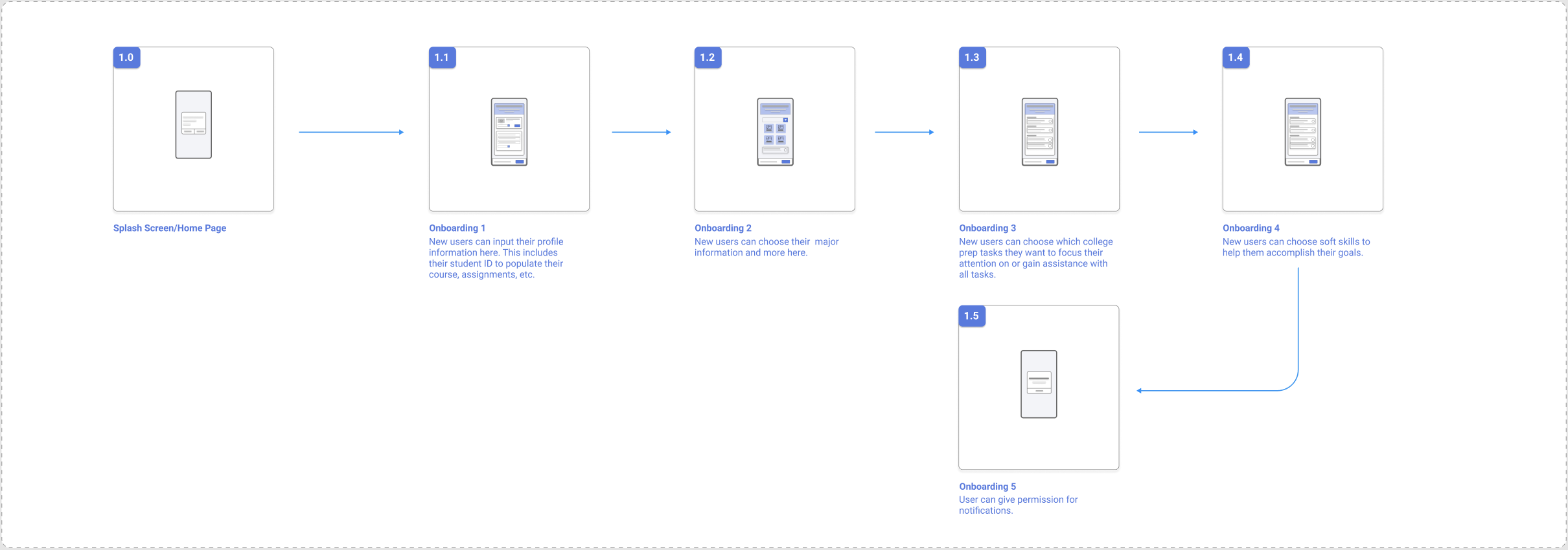
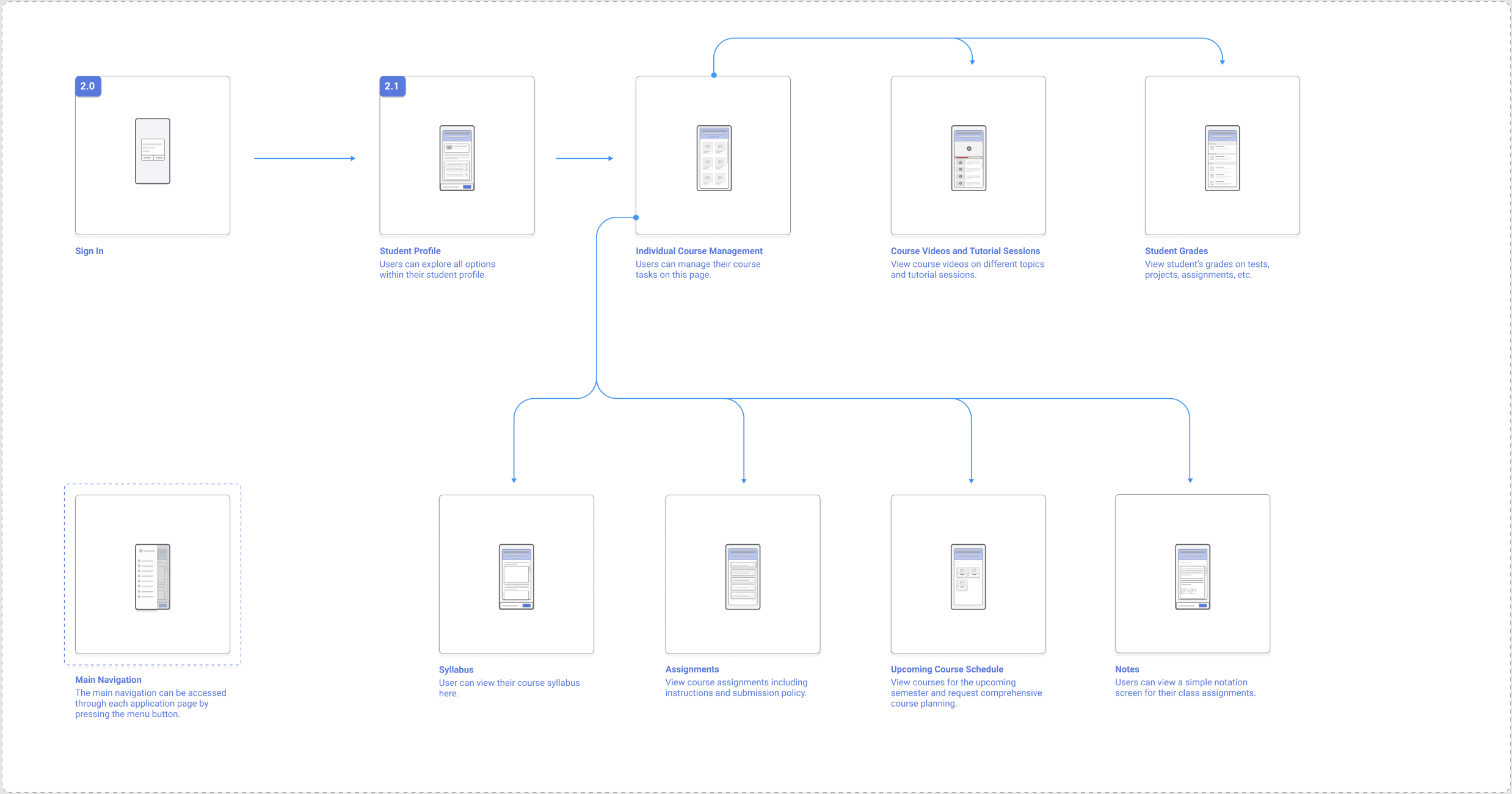
In order to visualize the journey the target audience would take, a streamlined user flow was created to illustrate the onboarding and student profile experience. This assisted in further solidifying the actions a user would take in the beginning stages of the application.
The onboarding screens show the possible journey a user would take when a student creates a new account. This flow would include the standard, but not limited to:
Exploring the student profile includes:
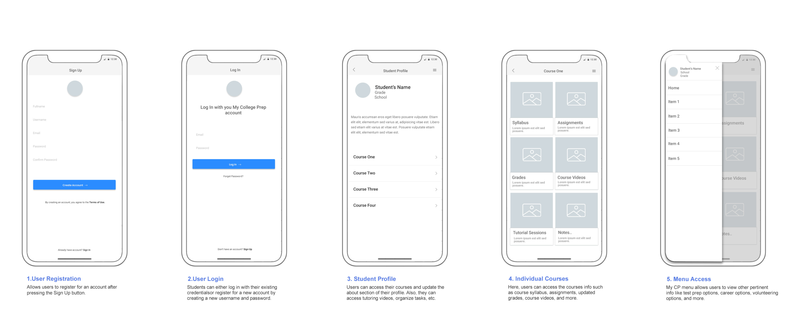
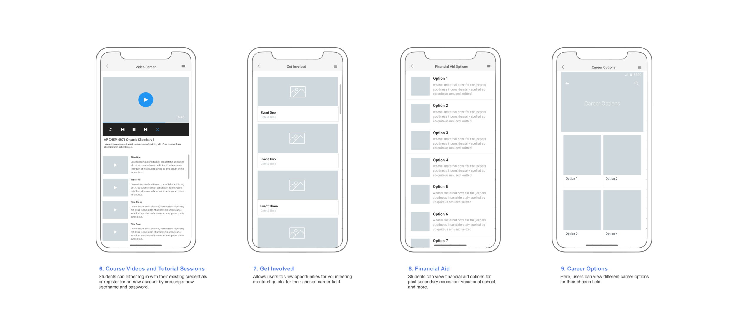
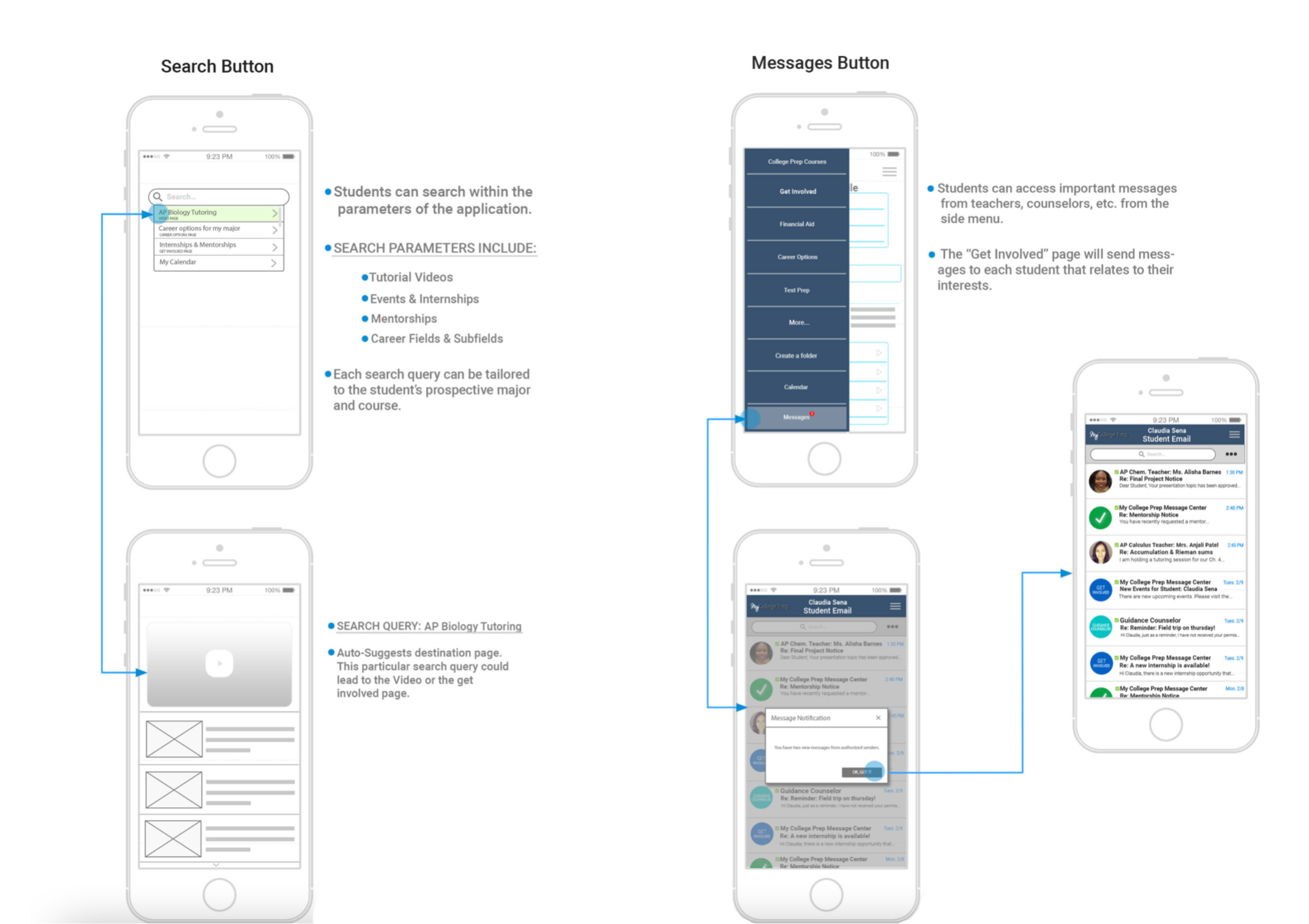
To further validate the design and functionality, I created wireframes in Figma that could be used for brief usability tests. This would help to determine the strengths and weaknesses of the app from the user’s feedback. Below is a condensed version of the app’s wireframes.
I created a wireframe to further develop the design and functionality on each page. This could be used for quick usability tests to determine the strengths and issues of the application determined by the target audience. The following considerations were formulated:
In order to further validate the idea, I conducted a series of 1:1 interviews with the primary base I was targeting. Participants were found on User Zoom to engage in a series of two 30 minute interviews. I utilized the responses to understand what participants would need to feel prepared for higher education, a career choice, and their existing coursework.
Questions were grouped into three categories:
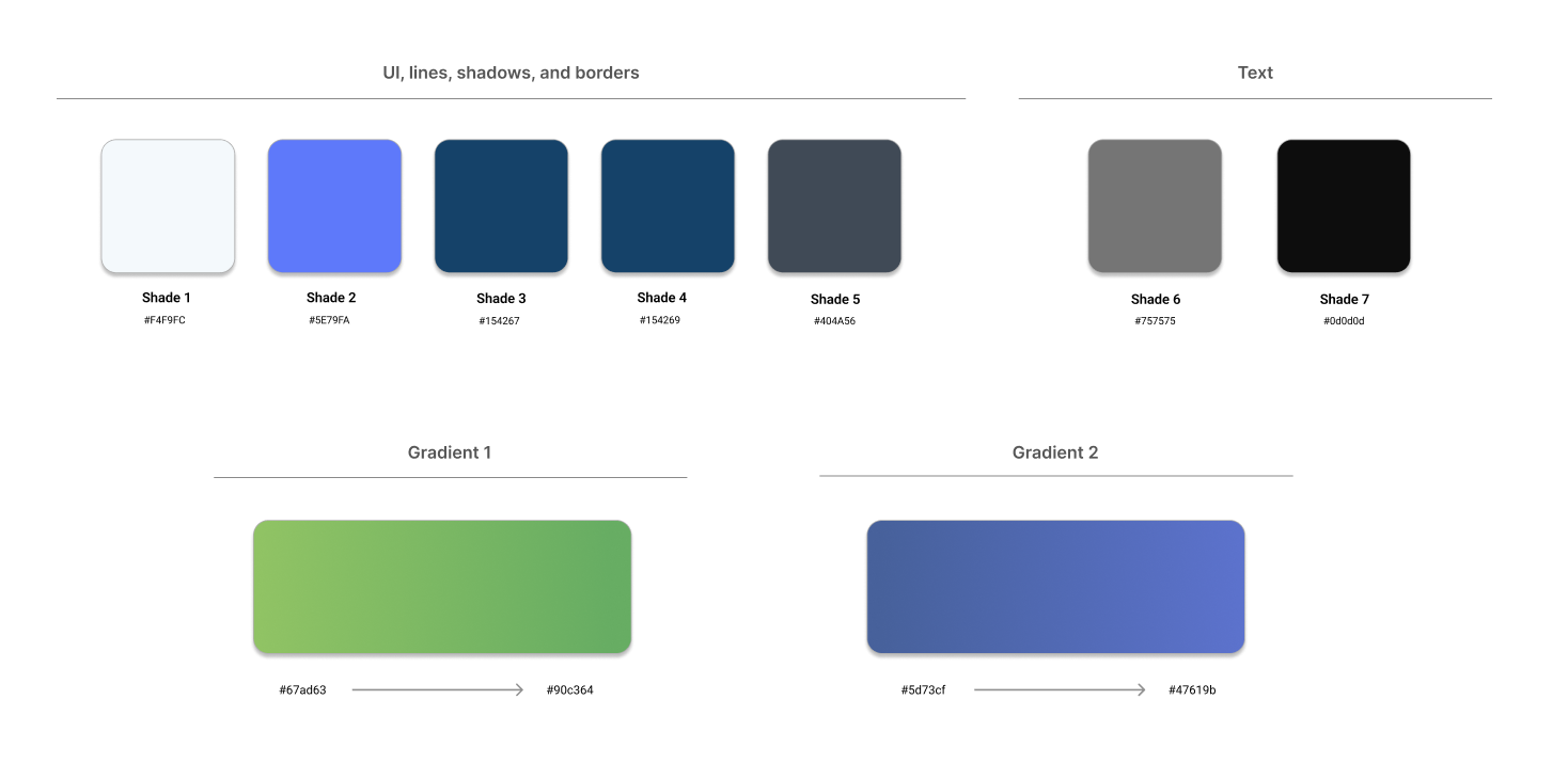
The design system was built with scalability in mind so that all users can utilize the application on all devices. Below is a condensed version of the design system for the application.
For the color scheme, I chose to use a variation of blue, purple, and pure white as the base for the user interface. Blue hues, in psychology, are used to aid in concentration and lowering the heart rate.
Raleway and DM Sans, two San serif fonts were used for the typography. They are both legible and come with different weight options for header and paragraph usage. For the icons, I wanted to use a minimalist feel so they wouldn’t distract from the main content of the applications.
For the design exploration and application flow, I used Figma to communicate the app’s transitions and interactions. Prototyping is essential for analyzing the flow, testing the design, and gaining actual user feedback before the development phase.
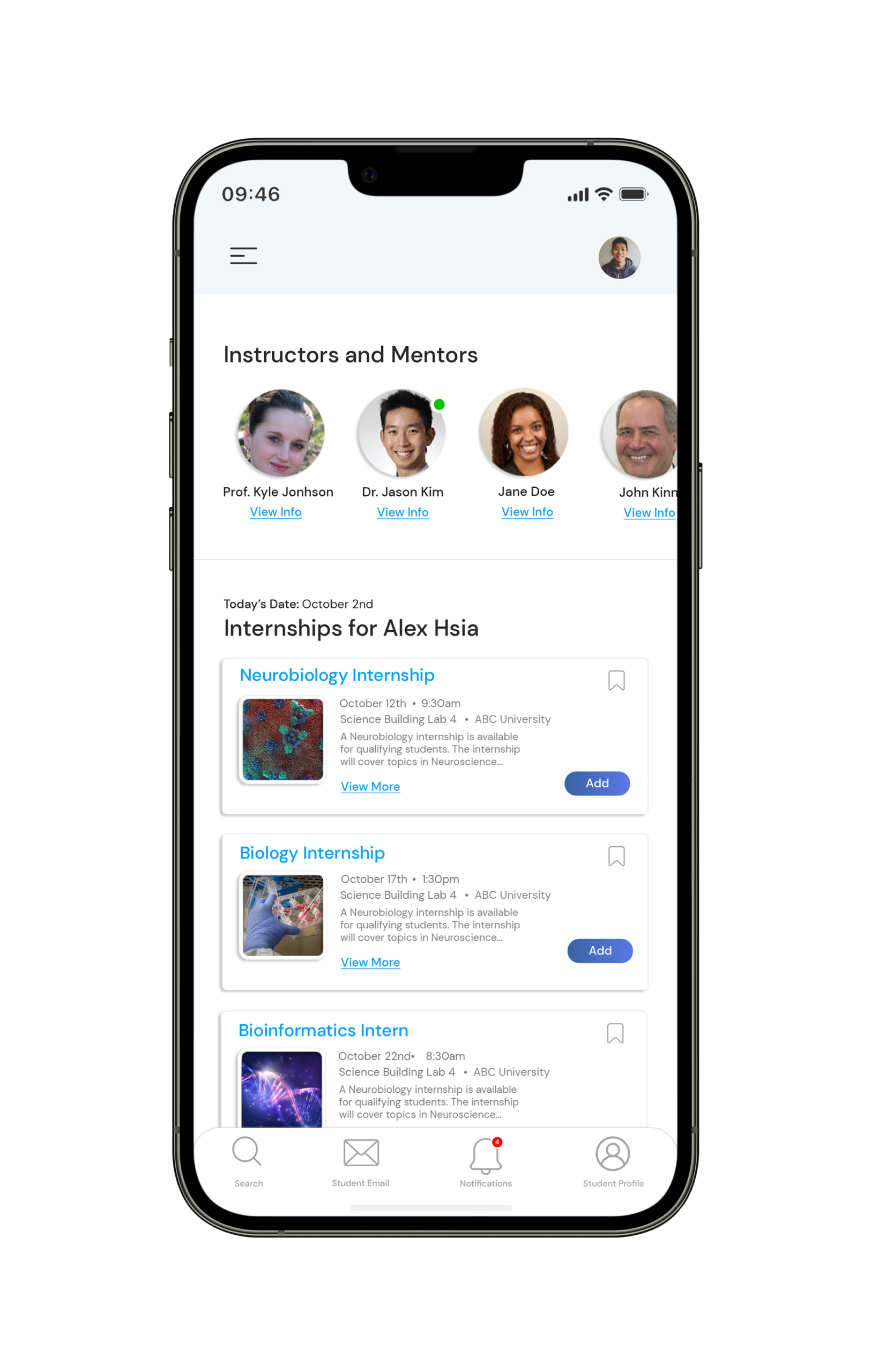
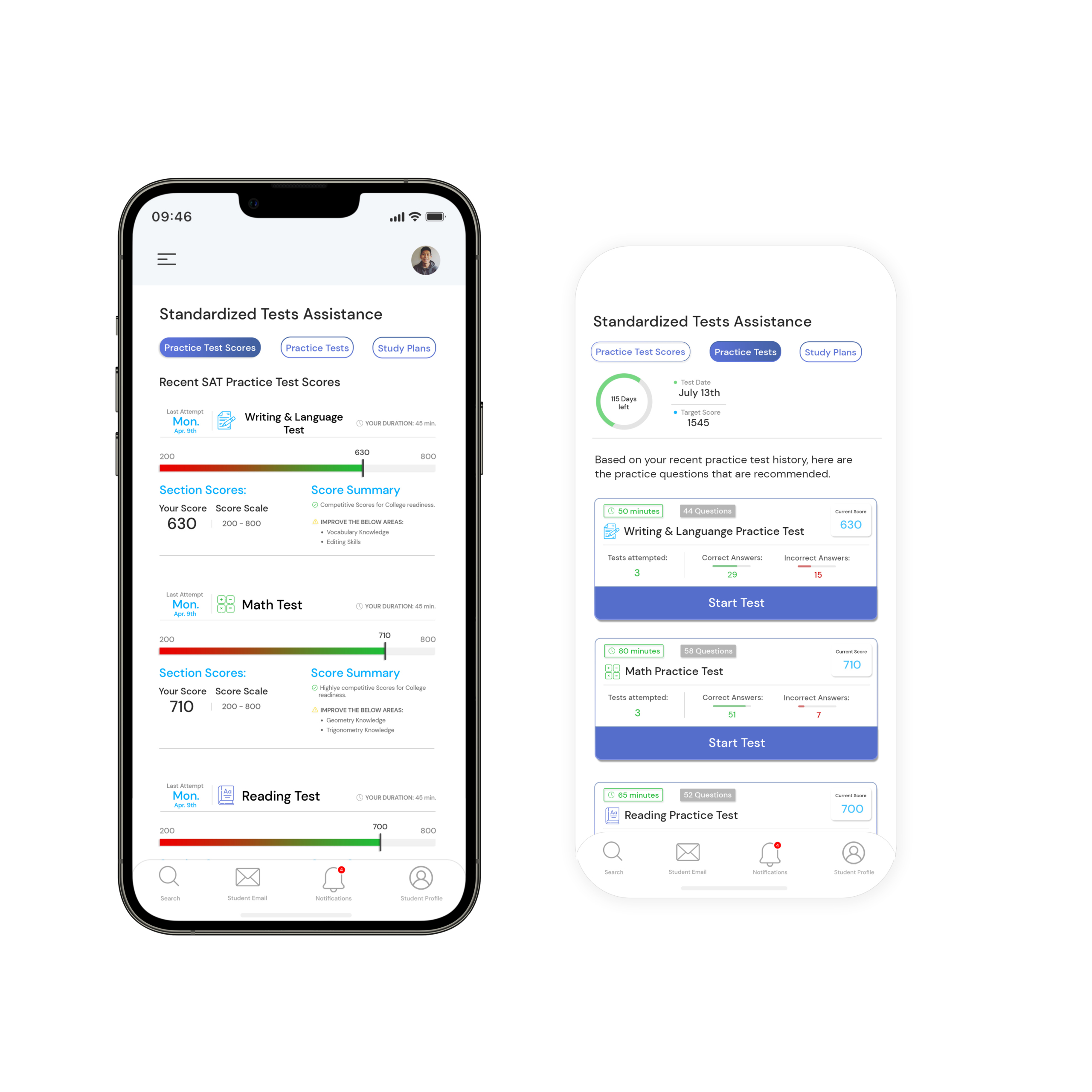
While designing the UI, I wanted to showcase some of the applications including:
Before proceeding to the final design handoff, I wanted to continue to validate the ideas and hypotheses, identify any usability issues, and test accessibility.
An evaluation of the application was performed with a 1:1 session with seven participants. 2 participants were high school students, 2 were middle school students, 2 teachers, and 1 guidance counselor. The teachers and guidance counselor who participated in the study felt that the application was well rounded, and focused on the main points for preparing students for higher education.
The high schoolers displayed more eagerness toward the application’s college and major preparation features as they were closer to graduation. The middle school students focused more on the application’s career exploration feature as they were not as sure of what career path they wanted to take yet. A cognitive walkthrough and a brief structured interview were conducted. Below are the findings from the user study:
I found that middle schoolers were more focused on finding a career path that they would like to prepare for. They craved more exposure to different professions before choosing one.
The high schoolers were more deliberate in their choices and had more of a structured path on what they wanted to pursue. They mainly wanted to focus on gaining the needed experience before continuing their college prep process.
The updated design focuses on providing more important details and features for the students, but also being straightforward in how students can accomplish each of their intended goals.
The user interface was kept very simple with more of a focus on what the application offers.
Drag on the below image for further information.
Paper & digital planning
From the findings and research, many students liked to incorporate paper planners along with keeping up with their assignments, labs, etc. via applications. One big difference was the application’s ability to alert or send notifications of possible internships, which was especially pertinent to graduating juniors and seniors who wanted to gain last-minute experience in their field.
Focusing on problematic areas
Tutorial videos work great for helping students with areas they struggle in, however, many wanted tutorials and videos that focused specifically on those areas rather than viewing videos on topics they already understand. Suggestions were made to list the problem areas in the course section and have tutorials tailored to these areas.
Comments are closed.