NAPA/ProLink
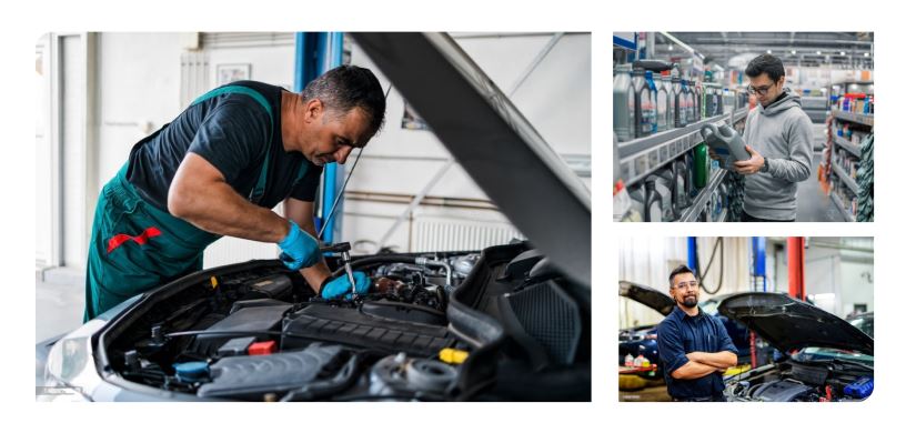


To continue to partner with parts businesses nationwide, the Prolink b2b system was created to offer a variety of shop solutions. During the redesign of the platform, I was one of the main UX Designers that assisted with the experience to give the user a more updated feel.
This leaves a limited network between dealers with very little interaction to build a business relationship and to conduct buying and selling procedures. Along with the cost and time-consuming policies associated with physical and online auctions, many dealers feel restrained by the limit on trading and trade fees, which can add more stress especially on smaller dealers who only sell 400-500 cars per year.
Our current users were quite satisfied with the toolset, but bridging the gap between keeping current users happy and attracting new users was a gray area that needed to be filled. Stakeholders wanted to keep a simple and easy to understand UI as the main demographic of the site were middle to later ages and may not be too keen on learning a completely new design.
How was testing performed? Since the majority of the user research was already established, the majority of the Prolink users fell into two categories.
Existing users: This user base consisted mostly of an older demographic who was used to the current platform.
New and incoming users: New users who enjoyed the offerings, but were used to a better user experience on all digital platforms and a more up to date UI.


What does ProLink offer versus the competitors? Before moving into the design phase, I wanted to record the current information architecture of the site, then compare it to the competition. Some of the questions I asked myself while studying the different IA structures were:
Questions were grouped into three categories:
Question 1: What can be done to improve the existing IA?
Question 2: How does the IA compare to the competition’s and is it understandable to the user?
Question 3: Does the flow of the IA make sense or is it complicated?
As an example, Advanced Pro, one of our main competitors, offered a complete management system including services outside of their main objective such as animation to help explain to customers complex services, technical training services for shop employees, and a Pro rewards system that allows customers to earn points that can go towards future purchases.
Information Architecture Analysis After studying the IA or Prolink and it’s main competitors, I found that:
-All three of the main competitor sites offer a more simplistic and straightforward way to search for parts with only a few steps for the user to take.
– They have a vehicle sorter, which sorts for vehicles that were previously searched by the user meaning quicker parts lookup.
-Shop catalogs showing parts from current and previous years, more comprehensive technical training for services, among other services are offered.
Along with the above findings, the sites also have a more responsive experience for users to view on their different devices.
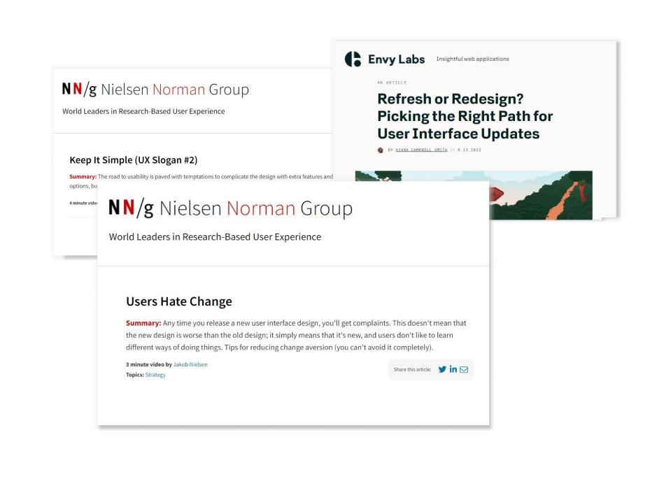
The above image shows The Boston Globe's website example of responsive design from desktop to mobile. It depicts a 3-column design dynamically changing to a two column version for tablet, and finally a single column mobile design. Example from The nngroup.com The new site would be completed in phases, and the top used areas were our main concern for phase one. We didn’t want to take the entire platform down during redesign, however we decided gradually building the new site would give users the time to get acclimated. I moved forward with creating user flows for these areas before moving into wireframes and UI design.
The team already concluded that the search feature needed fewer steps to give results, and being that it is such a crucial part of the platform, this section would be developed last.
User flow shows the results after searching for parts within the Prolink platform. Three different parts are shown which shows very basic information about the part. After clicking on the part, a new page would appear.
The previous flow included only a section that will take users directly to an individual parts page. Many users wanted the option to have a modal open to view a few more details, and an individual page for cart checkout.
Real estate for information was a big issue when displaying product results. Important info like warranties, part warning labels, and detailed specifications needed more space than the results page could offer. We opted for a slide-out panel or modal so that users can easily go back to the results page. Utilizing a slide-out panel can easily draw users attention to further crucial details, without having to visit the full product page.
User flow shows the results after searching for parts within the Prolink platform. Three different parts are shown which shows very basic information about the part. After clicking on the part, a new page would appear.
The next page was the cart page. This was one of the most important pages during the redesign of the platform as it contained:
– A final review of what’s in the user’s cart before purchasing.
– Allows the user to know the final purchase price of their cart.
– A review of the payment methods that can be utilized.
– The ability to update and remove items within the cart and other important tasks.
The user flow was updated to accommodate other payment methods that stakeholders wanted to add. Previously, the only method was using a credit card. Also, the option to print, save cart for a later time, and delete the entire cart were requested features from the research team.
For the first cart/checkout iteration, I focused on the process of most e-commerce purchase points. This manifested in a three part step system that included the cart, checkout, and final order confirmation page.
Also, one of the most crucial steps was including the part availability information so that users can see where the part is coming from. We wanted to also include:
– The different pricing structure: core, list, ENV, and total price.
– The ability to add a quick part pertaining to a specific vehicle.
– Increase part quantity and delete parts at will.
– Other ecommerce capabilities.
After gaining feedback from stakeholders, the main points focused on streamlining the cart page and not overwhelming the user with information. I transitioned into working on the order details page after a user submits their order. Stakeholders wanted to implement a tracking area, similar to other e-commerce sites.
We decided to keep the order details page simple and showcase the products purchased and their prices, the fulfillment status, order name, order schedule, vehicle fitment, and other pertinent information.
The option to print or save the cart for later were also two features that were included in the new design.
In the second iteration, a tracking modal was added in order to allow the user to track their recent orders. This would then provide users with a tracking link to an outside shipping partner.
After showcasing the cart and checkout transition to stakeholders, I was tasked to start on our next most important task. The replenishment and stock solution for recurring orders. Automotive parts shops and businesses usually utilize a replenishment system that assists owners in restocking and inventory management.
This system’s UI should be kept simple because we wanted the target user to focus on the main points:
– Order history
– Replenishment system
– Stock orders
– Inventory management
After a user makes a transaction, the order history would show the user pertinent information about their past orders. I decided to create a list of features and their uses for the order history page in order to focus on what’s needed by the user.
The order history page was kept simple and very similar to the original page. We wanted to also include a filtering system that includes the order status, the time frame the order was placed, and the store location for the order. These filters would help to narrow down a search for the user instead of going through pages of orders.
In conjunction with Sean Madden, we created the order history and stock order UI that was largely based on the previous system, but with an updated user experience that gave the platform a current and up to date feel.
With the updated user interface, our main goal was to bring a fresh and up-to-date appeal to an application that hadn’t been updated since the early 2000s. In the end, the feedback was overwhelmingly positive as users who utilized the application on their phones can experience a responsive design.
One of the main focuses was on keeping the b2b site as simple as possible so that users can focus on the main functionality of the site’s intended purpose.
Users can view their order history that can be filtered by specific criteria. This functionality helps the user to locate orders in an an efficient manner.
Search parameters include:
Above shows the order history page after searching with specific key words. The key words will filter out all orders that match.
This screen also shows the message bubbles when an order has been deleted successfully, and when an error has occurred for any reason. A feature that was not included in the previous UI.
The stock orders screen allows users to view their created stock orders and details. Users can also create a new stock order from scratch or use one of the templates that have the most used items needed in shops.
After a user clicks on the add new stock order button, a new field will appear where they can enter a part number to add to their stock order.
Alternatively, users can import a file to import that has all the parts they need instead of entering them manually.
After completing the stock order system, I transitioned into working on the shipping system and ensuring the accessibility standards were followed for all of our users.
We wanted to keep the same shipping accessibility standards that included high contrast colors, legible font, and a simple tabbing system so that users can differentiate between shipping times and dates.
The availability details were designed to be a modal window that will appear when a user clicks on an item that they would like to have shipped to their local NAPA store.
Bringing the site into a more contemporary experience was one of the most important tasks of the redesign. As we all use our mobile devices more and more, the previous site gave a very antiquated feel and many of the platforms users would leave for platforms that had better user experience. I’ve learned that a responsive site should be one of the number one characteristics for having good user experience.
The user’s feedback and experience of an application should be the backbone of an experience. I’ve learned that it is imperative to do user research throughout the creation of a design, and their feedback is of the utmost importance. This let’s the user know that you are empathetic to their needs, can put yourself in their shoes, and that designers are using an iterative process that makes their feedback number one priority.