Polaris
Loaded
*DISCLAIMER: All mobile Hero header designs completed by a fellow UX Designer on the team.
I was a part of the Digital Experience team whose goal was to redesign the digital presence of Polaris and overall create an improved experience for the user. In addition, I worked alongside several team stakeholders to assist with the digital redesign of different Polaris product areas.
I was a part of an ambition digital redesign project that would help to streamline the brand and create a less complex experience for the user.
I wanted to begin by researching what the general Polaris user wanted in a digital platform and how to educate a beginner user while also keeping our intermediate and expert users in mind.
I knew that users of the vehicles ranged from beginner to expert, and we wanted to make sure all users knew what type of vehicle they wanted by being as informed as possible about product offerings. This took a bit of knowledge about how most users like to learn.


User research question
How was testing performed? In order to gain more insight from users, testing was performed to see what responsive example users preferred. We wanted to learn how users responded to a hero header vs a normal sized header. I used UserZoom to formulate questions to ask and learn about the user’s overall experience.
Below is a presentation showcasing the research strategy I performed for user testing.


Research Findings

Gender: Female, Age: 30, Location: Denver, Co

Gender: Male, Age: 54, Location: Decorah, Iowa

ASPD *fictional police dept.
Mobile headers


As many of our new users were beginner to intermediate, with lots of loyal and expert customers in between, we wanted to make sure our entire base received a comprehensive understanding of the brands expansive product lineup.
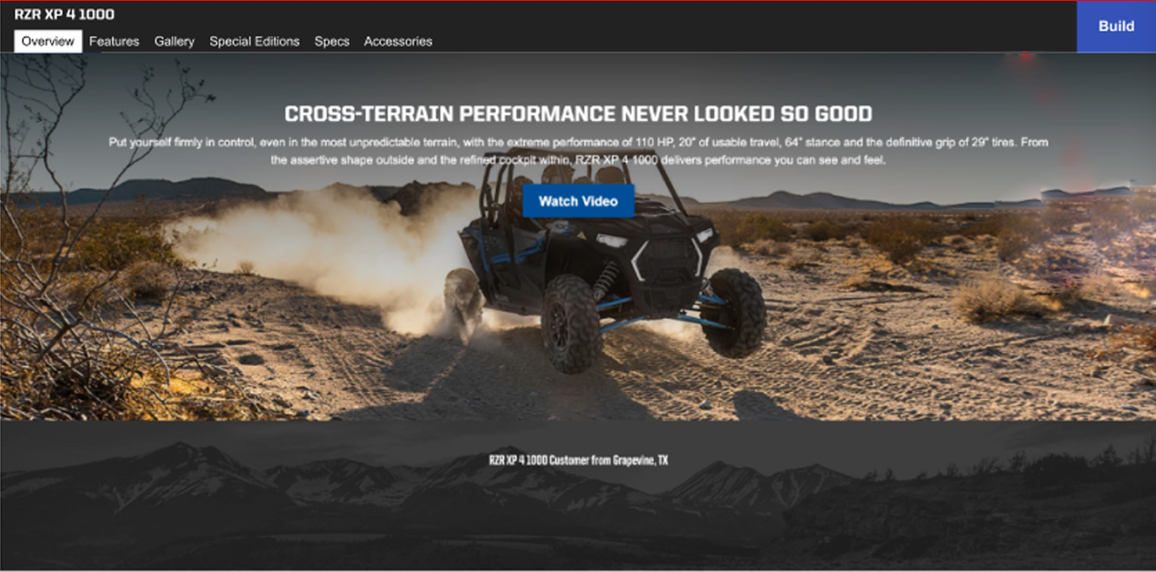
With the digital revamp, we wanted to bring the product sites, especially the mobile versions, to a more up to date and contemporary feel for the user. Hero headers, a feature used in many automotive company lines like Tesla’s model 3 vehicle, gives users a full screen view of the product they may purchase, and leaves a good impression on the user with what the product is capable of.
I wasn’t surprised at the findings as most users wanted some form of education and know-how of the product before beginning their journey to purchasing a product Users had seen Polaris products in several tv-show, movies, and several other places, so they were familiar with the brand. However, many users wanted to see what the products could do in their everyday lives.
During earlier research, many questions arose consistently while showcasing the hero header designs. One of our main goals was not to overwhelm the user with too much product information, as most people tend to lose focus if there is not a good balance of interesting images and product info.
I wanted to create a series of “How might we..” questions to help formulate ideas on how the user can learn about different brand products.


How users learn the best Interactive examples and hands-on experience are two of the best ways to not only keep users’ attention and focus but educate them about a specific product. Most if not all users enjoy having a high level of interaction while viewing a product they may considering buying in the future. Overall, Interactivity helps to increase engagement, interest, and knowledge in the product.
Large action images and shorter product videos that have the right amount of time to hold user’s focus, are also ways that can be implemented on the site to keep the user’s focus. Since in person product tours and test drives were already offered, the focus was on giving an optimal and enjoyable experience for the digital redesign.


We wanted to focus on ensuring the user was incredibly confident when considering purchasing a product. One of our main goals was to showcase what the vehicles can do, and how users can apply that to their everyday lives. As mentioned, the Polaris userbase spans a variety of users. However, most users were categorized into three main areas:
— Expert users who have a well-rounded knowledge of the Polaris products, and who have purchased products before.
— Third party and occasional users who have used the vehicles via others, different activities, etc.
— New users who are familiar with the brand and would like to purchase in the future.
One of my earliest design challenges was understanding what content to present first after the hero header. A lot of users would come to a specific model site to just peruse after seeing a RZR or other model that piqued their interest.
I wanted to more clearly understand what content should be displayed on a hierarchical scale, and how users thought about this scale. I performed an online survey with eight participants to gain more information about this topic.
The results showed that the majority of users wanted the model intro to include the hero header and or a shorter length video, then focusing on the interactive content, testimonials, and large HD images. Also, events and special programs were ranked lower than the aformentioned. This content hierarchy needed to also consider the standard layout structure or business needs.
The content structure was already established by stakeholders to be in a specific order. Stake holders wanted to continue with the tested hierarchy of information as users had gravitated towards this structure.
The sections were, however, made interchangeable to be placed in different sections depending on future testing needs. We wanted to ensure that users were focusing on the most important aspects of a specific vehicle model and any other pertinent incentives.
— New users who are familiar with the brand and would like to purchase in the future.
The preliminary first designs focused on showcasing a low to mid fidelity wireframe where users can explore the model by utilizing videos and 3D models to learn about a specific vehicle.
The goal was to offer users information without overwhelming them. The mobile version shows partner images that were brought up stakeholders after the desktop version was completed.
After presenting the above designs, I wanted to gain insight from stakeholders on the flow and design layout. Our main focus was to concentrate on the home pages of each model page instead of the information architecture at the moment. Some of the areas I wanted to focus on were:
Questions were grouped into three categories:
— Identifying any potential concerns or design obstacles.
— Continue to understand competitor sites and any market challenges.
— Accessing any design limitations that may be an issue later on
Most of the stakeholder feedback focused on the overall design flow and layout. Some of the feedback is shown to the right.


This design was created to include all users, from beginner to expert, to gain a deeper knowledge of different models across the Polaris brand. Also, to further introduce other vehicles, including boats and motorcycles, under the Polaris umbrella.
Gaining both user and stakeholder feedback, that included business goals, helped to give a more comprehensive view of how I should move forward with the desktop design. One of the main concept changes mentioned by stakeholders was combining the hero header and large HD videos section into one, moreover, being able to scroll from a hero image to a brief and interesting video that would draw the user in. My process included translating the feedback into hi-fidelity design comps.

Users can scroll through a 3D model of a vehicle to see all sides and learn some information about the specific vehicle like engine specs, accessories, safety features, etc.


Overall, the focus was on giving users a more immersive and educational experience with the new update. Utilizing the hero header images and videos gave users a great first impression of the site with a visually appealing and intriguing introduction. This new concept also let users get a glimpse of what the rest of the site will look like. With the 3D model, users were able to gain educational exposure to a vehicle, without overwhelming them.
A user centered standard and principle that I continued to cultivate and learn from Polaris was to have a simple, yet effective educational side to products where users are left feeling informed about every aspect of a product. This can, and usually does involve ensuring that the user experience is not only up to date but can be changed at any time to go along with user testing results.
Demonstrating care for the user and ensuring that they understood how to use products was a top priority for the digital redesign. Having multiple rounds of user testing throughout each phase shows users that we are dedicated to giving them a great experience.
Along with the redesign, Polaris also offered several ways to get to know a product from great first impressions, interactive 3D models, dedicated customer service, and in person tours and use, having multiple learning channels also shows users a strong drive to always keep users informed and having a clear mind.