
NAPA Prolink
Auto Replenishment Solutions
Details
My Role
Skills
Product design
Stakeholder management
Interactive prototyping
Year

Key Concern
The Problem
Initial Research
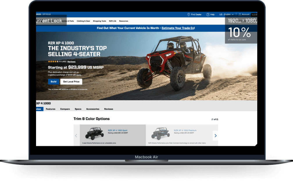
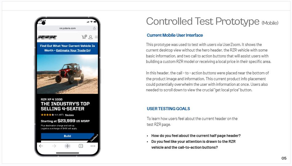
We began our initial research by testing the site header, recognizing it as the first element customers interact with. Our goal was to make the header more eye-catching and impactful.
Based on user feedback on the original design, we introduced a new hero header feature to deliver a more engaging and immersive vehicle view. Through User Zoom, users tested controlled and experimental prototypes to provide feedback on both the current header design and the potential hero header concept. This testing aimed to answer the following questions:
Research Questions
01
02



02


Visuals First: Research Findings
After testing both the original and hero headers, users noted that the original header lacked impact, with their attention divided between the image and vehicle information, resulting in a lack of focus. In contrast, they found the new header much more engaging, prompting them to continue scrolling to learn more about the vehicle.
What is NAPA's ProLink Platform?
A B2B platform for complete parts and shop solutions.
A B2B auto shop platform delivering complete solutions for professionals, including inventory management, shop training, service facility support, technician tools, reordering, and more.
Before starting the design phase, we documented the current IA and compared it to key competitors. This process raised questions such as:
With extensive user research already conducted, we identified that Prolink users predominantly fall into two main categories, each with distinct needs and behaviors that shaped the platform's design and functionality priorities.
Existing Users
The redesign prioritized ease of use and familiarity to ensure a seamless transition for the platform's older, experienced user base.
New & Incoming Users
New users appreciated the features but expected a more polished experience, including better responsiveness and an upgraded UI.
Process
SLIDESHOW 2.0
Interactive modules showcase vehicle features
Videos and articles offer in-depth information
Hero images and vehicle shots showcasing ATVs for all experience levels.
Search features help users quickly find the right vehicle
Our most advanced Spatial Audio system ever.
Dual-driver audio pods positioned next to each ear deliver personalized sound while letting you hear what’s around you. Spatial Audio makes sounds feel like they’re coming from your surroundings. Audio ray tracing analyzes your room’s acoustic properties to adapt and match sound to your space. And if you want to use headphones with Apple Vision Pro, the new AirPods Pro (2nd generation) with USB‑C offer the perfect experience, featuring Lossless Audio with ultra-low latency enabled by the H2 chip in both devices.


